

When I first cut my teeth on the internet, the web felt like a wild frontier—pixels scattered across screens, and every click was a tiny adventure. Today, the landscape is polished, fast, and unbelievably dense, yet paradoxically, many sites still feel flat, mechanical, and disconnected from the people behind the mouse cursor. This isn’t a problem you solve with a new framework or a flashier animation library; it’s a mindset shift. It’s about designing sites that feel like a conversation, not a broadcast.
From Transactional to Relational: The New Web Design Imperative
Most B2B sites still treat visitors as leads to be captured, not as humans to be understood. The difference is subtle but powerful. A relational design approach asks: What does the visitor need to feel heard, respected, and motivated to act? It starts with listening—not just to data points, but to the unspoken cues that surface in tone, timing, and interaction patterns.
- Micro‑moments become the new touchpoints. A single hover, a subtle loading animation, or a thoughtful error message can turn friction into delight.
- Contextual storytelling weaves product value into the visitor’s own narrative, rather than imposing a generic sales pitch.
- Human‑scale pacing respects the visitor’s mental bandwidth, giving space for comprehension instead of overwhelming them with endless scroll.
The Quiet Power of Whitespace
Whitespace isn’t “empty space” – it’s a design ally that gives content room to breathe. In the rush to cram more information onto a page, many teams sacrifice clarity for density. The result? Visitors skim, miss crucial details, and leave frustrated.
Consider the following three ways to use whitespace strategically:
- Visual hierarchy: By allocating generous margins around headings and call‑to‑actions, you signal importance and guide the eye naturally.
- Reduced cognitive load: A clean canvas lowers the mental effort required to parse information, which in turn improves conversion rates.
- Brand personality: A spacious layout can convey confidence and calm, aligning the brand with a premium, trustworthy image.
When you pair whitespace with purposeful color accents, you create a rhythm that feels both sophisticated and approachable.
Design Systems: The Unsung Hero of Consistency
Think of a design system as a living style guide—an evolving toolbox that ensures every component, from buttons to error states, speaks the same language. The benefits extend far beyond visual consistency:
- Speed to market: Teams can reuse pre‑built components, reducing development cycles and freeing time for strategic work.
- Scalable collaboration: Designers, developers, and product managers all pull from a shared vocabulary, minimizing miscommunication.
- Future‑proofing: When a brand refresh rolls out, updates cascade automatically across the entire site.
Implementing a design system may feel daunting at first, but start small—a button library or a typographic scale—and expand iteratively. The payoff is a site that feels cohesive, no matter how many pages or campaigns you launch.
Inclusive Design: Beyond Legal Compliance
Accessibility is often reduced to a checklist: alt text, contrast ratios, keyboard navigation. While those are essential, true inclusive design asks a deeper question: How can we craft experiences that feel welcoming to the widest possible audience?
Here are three practices that go the extra mile:
- Flexible UI controls: Allow users to adjust font size, line height, and motion intensity on the fly. A simple toggle for “reduced motion” can make a site usable for people with vestibular sensitivities.
- Descriptive microcopy: Error messages and form hints should explain why something went wrong, not just that it did. This reduces anxiety for users who rely on assistive tech.
- Empathetic testing: Invite participants with diverse abilities to walk through key flows. Their feedback uncovers blind spots that even the most thorough audit can miss.
When inclusivity becomes a core design principle rather than an after‑thought, you’ll notice lower bounce rates, higher engagement, and a brand reputation that feels genuinely caring.
Carbon‑Aware Web Design: A Responsibility Worth Embracing
Every kilobyte transferred contributes to energy consumption, and the web’s carbon footprint is no longer negligible. Sustainable design isn’t about sacrificing aesthetics; it’s about making smarter choices that keep both users and the planet happy.
Start with these low‑effort, high‑impact tactics:
- Optimize images using modern formats (WebP, AVIF) and serve them at the appropriate resolution based on device pixel density.
- Leverage lazy loading for off‑screen assets, ensuring that only what’s needed is fetched.
- Streamline CSS and JavaScript by removing unused selectors and splitting bundles so the browser only downloads what each page requires.
For teams hungry for deeper insight, tools that calculate page‑level carbon emissions can turn abstract numbers into actionable targets. A greener site often loads faster, too—a win‑win for users and SEO alike.
Micro‑Interactions: The Soul of a Digital Experience
Micro‑interactions are tiny, purposeful animations or feedback loops that acknowledge a user’s action. Think of a subtle button ripple, a cheerful checkmark after a form submit, or a gentle shake when a password fails validation. These details are the “digital equivalent of a nod” – they reassure users that the system is responsive and alive.
Effective micro‑interactions share three characteristics:
- Purposeful: They serve a functional goal, like confirming an action or guiding the next step.
- Brief: They’re quick enough to not interrupt flow, typically lasting under 300 ms.
- Delightful: A dash of personality—perhaps a playful bounce or a soft color change—adds a human touch.
When you embed these moments thoughtfully, they accumulate into a memorable brand experience that feels less like a product and more like a companion.
Data‑Driven Empathy: Merging Analytics with Human Insight
Metrics are indispensable, but they can’t tell you why a visitor hesitated at a particular step. That’s where qualitative research steps in. Conducting short, on‑page surveys or usability labs uncovers the emotions behind the clicks.
Integrate both data streams by:
- Mapping heatmap hotspots to user interview quotes, revealing the story behind high‑engagement zones.
- Tracking conversion funnels alongside sentiment scores from post‑interaction polls.
- Running A/B tests that measure not only clicks but also perceived ease‑of‑use, using a quick 1‑5 rating widget.
This blended approach ensures that design decisions are rooted in empathy, not just numbers.
When Design Meets Development: Bridging the Communication Gap
Designers and developers often speak different dialects. The result? “Pixel‑perfect” designs that turn into buggy implementations. To close the gap:
- Adopt design tokens: Centralize colors, spacing, and typography values in a shared JSON file. Both design tools and codebases can reference the same source, eliminating inconsistencies.
- Use component‑first workflows: Build UI components in a sandbox (e.g., Storybook) before integrating them into pages. This gives developers a concrete reference and lets designers test real interactions early.
- Maintain a living documentation site: A style guide that lives alongside your codebase reduces guesswork and accelerates onboarding.
When the handoff becomes a collaborative iteration rather than a hand‑over, the final product is faster, more reliable, and feels cohesive.
Future‑Facing: Designing for Emerging Interaction Paradigms
Voice assistants, AR overlays, and gesture‑based interfaces are no longer futuristic concepts; they’re appearing in enterprise portals and B2B dashboards. Preparing your web design practice for these modalities doesn’t mean reinventing everything—just extending your existing principles.
Key considerations include:
- Consistent language: Whether a user taps a button or speaks a command, the phrasing should remain identical.
- Progressive disclosure: Offer only the most relevant options for each interaction mode, avoiding overload.
- Context awareness: Leverage device sensors (location, orientation) to tailor content without forcing manual input.
By treating these new channels as extensions of your web experience, you future‑proof your brand and stay ahead of user expectations.
Learning from the Community: A Quick Round‑Up
If you’re hungry for deeper dives, check out these related reads that inspired many of the ideas above:
- Edge‑First Web Development: Building Faster, Safer Sites – a solid technical foundation for performance‑centric design.
- Why the Best SaaS Teams Are Investing in AI‑Enhanced No‑Code Toolkits – offers perspective on rapid prototyping, which can accelerate design system rollout.
Final Thought: Design as a Conversation, Not a Monologue
Web design is no longer about making things look pretty; it’s about fostering an ongoing dialogue with every visitor who lands on your page. By embracing relational thinking, purposeful whitespace, inclusive practices, and sustainable choices, you turn a static site into a living, breathing experience that respects both the user and the planet.
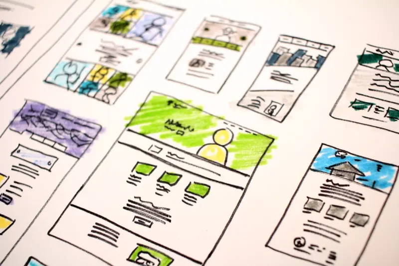
So the next time you sit down to sketch a new landing page, ask yourself: What will this visitor feel, think, and do after they leave? If the answer leans toward connection rather than conversion, you’re on the right track.

Miranda Murphy: Experienced freelance writer with a decade of storytelling expertise. Let's create something amazing together!
Related Posts

Sustainable Web Design: How I Blend Beauty, Performance, and Planet‑Friendly Practices
Lauren Miller reveals how sustainable web design balances visual appeal, speed, and environmental im... Read More

Designing for Neurodiversity: The Next Frontier in Inclusive Web Experiences
A deep dive into neuro‑inclusive web design, offering actionable principles, a step‑by‑step wo... Read More
Designing for the Planet: Sustainable Web Design Strategies That Don’t Sacrifice Style
Discover how to blend stunning visuals with sustainability by optimizing assets, building performanc... Read More
Top Posts

Synthetic Data: The Quiet Engine Powering Safer, Faster AI for SaaS
Synthetic data offers SaaS companies a privacy‑first, cost‑effective way to generate limitless training data, enabling faster model development, robust stre...Read More

Why Subscription Car Services Are Changing the Way We Drive
Subscription car services blend flexibility, all‑inclusive pricing, and eco‑friendly options, redefining how we access vehicles and prompting a shift in the...Read More

Level‑Up Your Day: Gaming Mechanics for Real‑World Mastery
Explore how micro‑goals, dynamic difficulty, storytelling, and rapid iteration from modern games can transform everyday work into a rewarding, level‑up expe...Read More

Networking Reimagined: From Static Links to Adaptive, Human‑Centric Fabric
A deep dive into modern networking, covering observability, zero‑trust, service mesh, network‑as‑code, and human‑centric design, offering actionable ste...Read More
0 Comments
Post Comment
You will need to Login or Register to comment on this post!