

Why Neurodiversity Matters in Modern Web Design
When the digital world claims to be “for everyone,” it often forgets that “everyone” includes a spectrum of cognitive styles, sensory preferences, and processing speeds that standard design conventions rarely accommodate. As a designer who has spent countless hours navigating both the chaotic brilliance of brainstorming sessions and the quiet focus of solitary coding, I’ve learned that the most successful interfaces are those that respect the brain’s natural variations rather than forcing users into a one‑size‑fits‑all mold. Embracing neurodiversity isn’t just a nice‑to‑have add‑on; it’s a strategic move that can boost engagement, reduce bounce rates, and foster brand loyalty among audiences that have historically felt invisible on the web.
Understanding the Spectrum of Cognitive Needs
Neurodiversity encompasses conditions such as autism, ADHD, dyslexia, and a range of less‑diagnosed processing differences, each bringing unique strengths and challenges to the way information is perceived and acted upon. For example, a user with ADHD might thrive on clear visual cues and dynamic feedback, while someone on the autism spectrum may prefer predictable layouts and minimal sensory noise. Recognizing these nuances allows designers to craft experiences that are simultaneously stimulating for some users and soothing for others, creating a balanced ecosystem where curiosity is encouraged without overwhelming the senses.
Integrating Inclusive Principles from the Start
Inclusive design should be baked into the project brief, not tacked on during a late‑stage audit, because retrofitting accessibility often leads to compromises that dilute the original intent. Begin by mapping user journeys that explicitly include neurodiverse personas, outlining how they might interact with navigation, forms, and media under different environmental conditions. Use storyboards that highlight potential friction points—such as rapid animation that could trigger sensory overload or dense text blocks that impede comprehension—and iterate early with low‑fidelity prototypes. By treating inclusivity as a foundational pillar, you set the stage for smoother handoffs between UX writers, visual designers, and developers, ensuring that every layer of the stack respects the same set of human‑centered values.
Color, Contrast, and Sensory Load
While bold palettes can energize a brand, they can also become a source of visual fatigue for users who are hypersensitive to contrast or flashing elements. Opt for a restrained color hierarchy that leverages natural, muted tones for backgrounds and reserves high‑contrast accents for actionable items like buttons or error messages. When you need to draw attention, consider using subtle motion—such as a gentle pulse or a soft slide—rather than stark color shifts that can trigger migraines or anxiety. This approach not only aligns with best practices for visual ergonomics but also supports users who rely on predictable visual cues to navigate complex information spaces. For a deeper dive into how sensory considerations intersect with broader design strategy, check out Audio Branding, which explores the auditory dimension of user experience.
Typography That Reads Like Conversation
Legibility is more than just choosing a clean font; it involves thoughtful line spacing, character width, and hierarchy that accommodate readers with dyslexia or reduced working memory. Sans‑serif typefaces with generous x‑height, such as Open Sans or Inter, tend to reduce character confusion, while a line‑height of 1.5 em provides the visual breathing room needed for smooth eye movement across paragraphs. Pair these choices with clear, concise copy that avoids jargon, and you’ll create a reading rhythm that feels more like a friendly dialogue than a dense lecture. Remember to test font scaling across devices, because users who increase text size for readability should never encounter layout breaks that obscure navigation or content hierarchy.
Navigation Patterns That Respect Cognitive Load
Complex mega‑menus and hidden drawers can be exciting for power users, but they often increase cognitive load for individuals who prefer linear, straightforward pathways. Prioritize a shallow information architecture where primary actions are reachable within two clicks, and supplement deeper content with breadcrumb trails that clearly indicate the user’s location within the site’s hierarchy. Incorporate “skip to content” links and clearly labeled anchor points so that keyboard‑only users and screen‑reader enthusiasts can bypass repetitive navigation elements without frustration. By offering multiple pathways—visual menus, search bars, and contextual links—you empower each visitor to choose the interaction model that aligns best with their mental workflow.
Data‑Driven Validation Through Diverse Testing
Quantitative metrics like click‑through rates and session duration only tell part of the story; qualitative feedback from neurodiverse participants reveals hidden barriers that analytics can’t surface. Conduct remote usability studies that include participants with a range of cognitive profiles, providing them with flexible testing environments—such as screen‑recording tools that allow pauses or note‑taking—to capture authentic reactions. Pair these insights with eye‑tracking or heat‑map data to understand where attention drifts or stalls, then iterate on the design based on concrete evidence rather than assumptions. For inspiration on harnessing data to drive user‑centric decisions, explore AI‑Powered Personal Knowledge Management, which demonstrates how structured insight can transform raw observations into actionable improvements.
Future‑Facing Technologies That Honor Neurodiversity
Artificial intelligence and machine learning are poised to personalize interfaces on a granular level, tailoring content density, animation speed, and even color schemes to individual preferences detected through behavior patterns. Imagine a browser extension that learns a user’s tolerance for motion and automatically dampens carousel speeds, or a CMS that suggests simplified copy for sections where readers linger longer than average. These adaptive systems can become silent allies for neurodiverse users, offering a seamless experience that feels custom‑built without the need for manual settings adjustments. However, developers must handle such personalization ethically, ensuring transparency and giving users full control over what data is collected and how it’s applied.
Championing a Culture of Inclusive Design Within Teams
Building neurodiverse‑friendly websites starts with fostering a workplace culture that values diverse perspectives and encourages open dialogue about cognitive accessibility. Host regular cross‑disciplinary workshops where designers, developers, copywriters, and product managers share personal experiences or research findings related to neurodiversity, turning abstract concepts into concrete design guidelines. Celebrate wins—such as a reduced error rate for form submissions after implementing clearer field labels—to reinforce the business impact of inclusive choices. When leadership models this commitment, it cascades through the organization, turning empathy into a measurable metric that drives continuous improvement across every project.
Conclusion: Designing for Minds, Not Just Screens
The internet’s true power lies in its ability to connect people across borders, cultures, and cognitive styles, and web designers hold the keys to unlocking that potential. By weaving neurodiversity into the very fabric of our design process—through thoughtful color, typography, navigation, and adaptive technology—we create digital spaces where every brain can flourish, engage, and contribute. As you plan your next redesign, ask yourself: does this experience honor the full spectrum of human thought, or does it silently exclude those who think differently? The answer will guide you toward designs that are not only beautiful but profoundly human.

When it comes to the world of blogging and writing, Rose DesRochers is a name that stands out. Her passion for creating quality content and connecting with her audience has made her a trusted voice in the industry. Aside from her skills as a writer and blogger, Rose is also known for her compassionate nature.
Related Posts

The Secret Power of Micro‑Interactions in Web Design
Micro‑interactions—tiny, purposeful animations and feedback—can turn a static SaaS interface i... Read More

Designing for Neurodiversity: Inclusive Web Experiences That Stick
Explore strategies for building web experiences that empower neurodivergent users, from adaptive mic... Read More

Designing for Neurodiversity: The Next Frontier in Inclusive Web Experiences
A deep dive into neuro‑inclusive web design, offering actionable principles, a step‑by‑step wo... Read More
Top Posts

The Silent Surge: Managing Mental Load in a Hyper‑Connected World
In today’s hyper‑connected environment, endless notifications and constant multitasking create a hidden mental load that harms productivity and wellbeing. T...Read More

First‑Party Data Strategies for Modern Search Engine Marketing
Discover why first‑party data is the new gold standard in search engine marketing and how to build a data‑driven SEM engine that respects privacy while deli...Read More

When Play Becomes a Platform: The New Age of Smart, Modular Toys
Smart, modular toys are reshaping play into a platform for learning, collaboration, and sustainability, offering adaptable experiences for kids, parents, and re...Read More
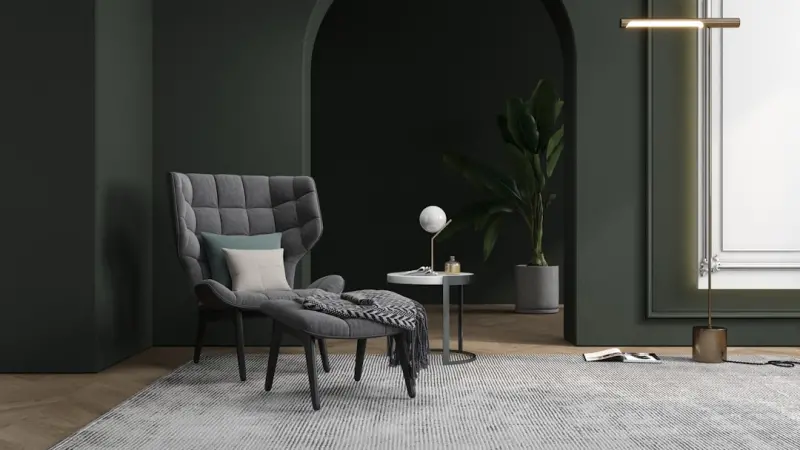
Layered Textiles: Turning Everyday Rooms into Tactile Masterpieces
Explore the art of layering fabrics—rugs, throws, cushions—to create warm, dynamic interiors that reflect your style and invite touch....Read More
0 Comments
Post Comment
You will need to Login or Register to comment on this post!