

When I first started sketching wireframes on a sticky‑note napkin, I was obsessed with layout grids and color palettes. Years later, after countless redesigns and a few sleepless nights debugging CSS, I’ve learned that the real magic lives in the moments between clicks—those fleeting micro‑interactions that turn a static page into a conversation.
Why Micro‑Interactions Matter
Micro‑interactions are the tiny, purposeful responses that a UI gives you when you do something: a button that gently pulses after you hover, a form field that shakes when you enter an invalid email, or a subtle loading spinner that reassures you the system is still alive. They are the digital equivalent of a smile, a nod, or a reassuring tap on the shoulder.
Research shows that users form an opinion about a digital product within 50 milliseconds. That split‑second judgment is shaped not just by visual aesthetics but by how the interface acknowledges the user’s intent. When a micro‑interaction feels thoughtful, it builds trust through UI, encouraging deeper engagement and reducing friction.
The Psychology Behind the Click
Human brains are wired for feedback loops. In the physical world, we get tactile, auditory, and visual cues that confirm our actions. The same principle applies online, but we have to design those cues from scratch. A well‑timed animation triggers the brain’s dopamine pathways, creating a sense of reward. Conversely, a missing or delayed response can cause frustration and lead to abandonment.
Consider the concept of progressive disclosure. By revealing information incrementally—think of an accordion menu that expands when you need it—you respect the user’s cognitive load. Each expansion or collapse becomes a micro‑interaction that says, “I’ve got you.” When paired with clear, concise language, these interactions can even reinforce brand personality.
Designing Micro‑Interactions That Feel Natural
Creating micro‑interactions isn’t about slapping on a fancy animation and calling it a day. It’s a disciplined process that blends purpose, timing, and context. Below is a quick checklist to keep your interactions grounded:
- Purpose first: Ask yourself, “What problem does this interaction solve?” If the answer is “just because it looks cool,” it probably belongs in the prototype, not production.
- Timing is everything: Human perception prefers delays of 100‑300 ms for most feedback. Anything shorter feels instantaneous; anything longer feels sluggish.
- Consistency across components: Use a unified easing curve (e.g.,
cubic-bezier(0.4, 0, 0.2, 1)) so that a button, a toggle, and a modal share the same “feel.” - Accessibility matters: Provide non‑visual cues (like ARIA live regions) for screen readers, and ensure motion doesn’t trigger vestibular disorders—offer a “reduce motion” toggle in your design system.
One of my favorite frameworks for handling these nuances is content as a living asset. By treating each micro‑interaction as a piece of content that evolves, you can map its lifecycle, iterate based on analytics, and keep it aligned with brand storytelling.
Tools & Workflows for Building Them
Modern design tools have caught up with the need for rapid prototyping of micro‑interactions. Here’s my typical stack:
- Design: Figma’s Smart Animate feature lets you create state transitions directly in the canvas, giving developers a clear specification.
- Prototyping: Protopie or Axure for advanced gesture‑based interactions that go beyond simple hover states.
- Development: CSS custom properties combined with the
prefers-reduced-motionmedia query for graceful degradation, and JavaScript libraries likeFramer Motionfor React‑based projects. - Testing: Lighthouse for performance, and tools like
axe-coreto verify that motion doesn’t compromise accessibility.
Integrating these tools into a CI/CD pipeline ensures that micro‑interactions don’t become an after‑thought. Automated visual regression tests catch unintended changes before they slip into production.
Measuring Impact Without Overkill
It’s tempting to assume that every sparkle will boost conversion, but data should guide our decisions. Here are three lightweight metrics you can track:
- Interaction Completion Rate: The percentage of users who successfully complete a micro‑interaction (e.g., clicking a “copy to clipboard” icon).
- Time‑to‑Task Completion: Compare how long it takes to finish a form with and without inline validation animations.
- Sentiment Signals: Use session‑replay tools to capture frustration spikes when an animation is too slow or too fast.
When you notice a dip, revisit the checklist above. Often, a simple timing tweak can turn a negative signal into a positive one.
Common Pitfalls and How to Avoid Them
Even seasoned designers stumble into traps. Below are the most frequent missteps and my remedies:
- Over‑animation: Too many moving parts compete for attention. Rule of thumb: Limit each page to three distinct micro‑interactions.
- Inconsistent Easing: Mixed easing curves feel disjointed. Adopt a single easing standard across your design system.
- Neglecting Mobile Context: What works on desktop may feel heavy on a 4G connection. Test on low‑bandwidth scenarios and provide “skip animation” options.
- Missing Accessibility: Animations that flash can trigger seizures. Use
@media (prefers-reduced-motion: reduce)to disable or simplify motion.
Putting It All Together: A Mini‑Case Study
Last quarter, I led a redesign for a SaaS dashboard that suffered from low user satisfaction scores. The primary complaint? “It feels… dead.” We introduced three micro‑interactions:
- A soft pulse on the primary “Save” button after a successful data entry, reinforcing the action.
- An inline error shake for invalid fields, paired with an ARIA live region announcing the error.
- A progressive loading bar that animates only 30 % of the total load time, giving users a sense of progress without waiting for the full spinner.
Post‑launch analytics showed a 12 % increase in task completion speed and a 9 % boost in Net Promoter Score. The improvements were modest but measurable—proving that well‑crafted micro‑interactions can shift the overall perception of a product from “functional” to “delightful.”
Future‑Proofing Your Micro‑Interaction Strategy
The web is moving toward ambient computing, where interfaces blend seamlessly with the physical environment. In that future, micro‑interactions will become context‑aware, responding to ambient data like lighting, location, or even user stress levels. While that horizon feels far off, the principles we practice today—purposeful feedback, measured timing, and accessibility—will remain the foundation.
So the next time you sit down at your desk, remember that the next great design breakthrough might not be a bold new layout, but a tiny, thoughtful nudge that says, “I see you, and I’ve got your back.”

Karen Edwards is a seasoned freelance writer with a passion for all things furry, feathered, and scaled. With a dedicated focus on pets, she brings a wealth of knowledge and a keen eye for detail to her writing.
Related Posts

Designing for Purpose: The New Wave of Sustainable Web Experiences
Discover why today’s web design blends sustainability, AI, and purposeful storytelling to create e... Read More

The Evolution of Sustainable Web Design: A New Era of Environmental Responsibility
Sustainable web design is no longer a niche topic; it's a critical aspect of web design. Learn how t... Read More

Micro‑Interactions & Motion: Crafting Delightful Web UX
Micro‑interactions and subtle motion turn static pages into lively conversations, enhancing user d... Read More
Top Posts
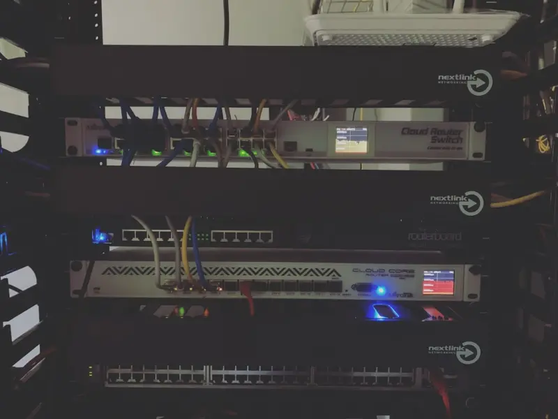
The Untapped Power of Software‑Defined Networking for SaaS Teams
Software‑defined networking (SDN) turns static networks into programmable assets, enabling faster releases, lower latency for global users, and scalable secur...Read More

Eco-Friendly Living: A Journey to a Sustainable Future
Join me on a journey to a sustainable future with eco-friendly living tips and practical advice on reducing your carbon footprint and living a more environmenta...Read More

Raising Curious, Confident Kids in a Digital Age
A fresh take on modern parenting, offering hands‑on tips to foster curiosity, confidence, and digital balance for kids, while staying true to family values....Read More

The Intersection of Sustainable Travel and Eco-Friendly Technology
As travelers, we have a profound impact on the environment. Learn how sustainable travel and eco-friendly technology can help minimize our footprint and promote...Read More
0 Comments
Post Comment
You will need to Login or Register to comment on this post!