

When I first started tinkering with HTML tags in a cramped dorm room, I thought “design” was just about making things look pretty. Fast forward to today, and I’ve learned that the real magic lives in the tiny, almost imperceptible moments that coax a user’s smile. Those moments—micro‑interactions and subtle motion—are the new lingua franca of web experiences, turning a static page into a living conversation.
The Psychology Behind the Flicker
Humans are wired to respond to movement. Evolutionary psychologists tell us that a sudden rustle in the underbrush triggers an immediate, subconscious attention shift. On the web, a well‑timed animation does the same thing, but without the predator anxiety. It signals responsiveness, affirms that the interface is listening, and guides the eye toward the next action.
Micro‑interactions are the brain’s reward loops in disguise. When a button subtly expands on hover or a checkbox ticks with a soft bounce, the brain releases a tiny burst of dopamine. That feel‑good signal reinforces the behavior, nudging users toward deeper engagement. It’s not about flashy gimmicks; it’s about engineering positive feedback at a subconscious level.
Design Systems: The Blueprint for Consistency
Scaling these nuanced experiences across a product suite requires a robust design system. Think of it as a living style guide that codifies motion, easing curves, and interaction states. By documenting the exact duration, delay, and easing function for each UI element, teams can ship new features without re‑inventing the interaction wheel every time.
A well‑structured system also democratizes design decisions. Developers can pull a pre‑approved motion token from a shared library, ensuring that the same “bounce” feels consistent whether it’s on a login form or a checkout flow. Consistency reduces cognitive load, letting users focus on their goals instead of relearning patterns.
Motion as a Narrative Tool
Every website tells a story. Motion is the narrative pacing, the way you reveal plot points. A hero image that gently slides in as the user scrolls sets a tone of elegance. A progress bar that fills in sync with a loading spinner creates a sense of forward momentum, reducing perceived wait times.
When you align motion with content hierarchy, you subtly guide the user’s journey. For instance, a delayed fade‑in for secondary information tells the brain, “You’ve got the primary message; now you can explore more if you want.” This hierarchy of attention is a silent, powerful storyteller.
Accessibility Meets Animation
There’s a myth that motion and accessibility are mutually exclusive. In reality, the two can coexist beautifully—if you design responsibly. Provide a reduced‑motion toggle or respect the user's prefers-reduced-motion media query. This ensures that users with vestibular sensitivities aren’t overwhelmed while still delivering a rich experience to those who can enjoy it.
Moreover, motion can enhance accessibility when used judiciously. A subtle shake on an invalid form field draws attention without relying on color alone, supporting users with color‑vision deficiencies. Pairing visual cues with ARIA live regions can also convey state changes to screen readers, bridging the gap between sighted and non‑sighted interactions.
Performance: The Unsung Hero of Delight
Delightful motion is only delightful if it feels instantaneous. A laggy animation becomes a source of frustration, breaking the trust you’ve painstakingly built. To keep interactions snappy, prioritize lightweight assets: SVGs over raster images, CSS transitions over JavaScript where possible, and always leverage hardware acceleration by animating transform and opacity properties.
Performance isn’t just about speed; it’s about perceived effort. A well‑optimized loading animation can mask network latency, turning a potential pain point into a calm, predictable pause. Tools like synthetic data can help simulate real‑world load scenarios, ensuring your motion remains buttery smooth even under stress.
Integrating Micro‑Interactions into the Development Workflow
Embedding motion into the dev pipeline starts with shared language. Define interaction intent: is this a confirmation, a warning, or a delight cue? Once intent is clear, map it to an animation spec—duration, easing, and trigger point. Store these specs in a JSON file or a design token system, making them version‑controlled alongside your UI components.
Automated testing shouldn’t ignore motion. Visual regression tools can capture frame‑by‑frame snapshots of animations, flagging unintended changes. Additionally, unit tests can assert that the correct CSS classes are applied when a user interaction occurs, ensuring the motion logic isn’t accidentally stripped out during refactors.
Case Study: From Dull to Dynamic
One of our clients—a B2B SaaS platform—had a minimalist dashboard that felt sterile. Users reported “it works, but it’s boring.” We introduced micro‑interactions: a gentle pulse on actionable icons, a sliding drawer for settings, and a contextual tooltip that fades in after a brief hover. Within two weeks, engagement metrics rose 27% and the average session length increased by 15 seconds. The key takeaway? Small motion changes can produce outsized behavioral shifts.
In that project, we also had to address security concerns. By collaborating with our security team, we ensured that motion assets didn’t become vectors for zero‑trust security loopholes. All animation libraries were vetted, and content‑security‑policy headers were updated to whitelist only trusted sources.
Future Trends: AI‑Assisted Motion Design
Artificial intelligence is beginning to democratize motion design. AI tools can suggest easing curves based on desired emotional impact or generate Lottie animations from simple sketches. While still in its infancy, this technology promises to reduce the friction between design intent and implementation, allowing designers to focus on storytelling rather than pixel‑perfect keyframe tweaking.
As AI models become more context‑aware, they’ll also help balance performance with visual richness—optimizing animations on the fly based on device capabilities and network conditions. Imagine a dashboard that automatically scales down animation complexity for a 3G connection while preserving the core interaction cues.
Putting It All Together: A Checklist for Delightful Web UX
- Define Intent: Every micro‑interaction should serve a purpose—feedback, guidance, or delight.
- Document Motion Specs: Use design tokens for duration, easing, and triggers.
- Prioritize Accessibility: Honor
prefers-reduced-motionand pair visual cues with ARIA alerts. - Optimize Performance: Stick to CSS transforms and opacity, use SVGs, and test with synthetic data loads.
- Integrate Into CI/CD: Include visual regression tests for animations.
- Secure Your Motion: Vet third‑party animation libraries against zero‑trust security standards.
- Iterate with Feedback: Use analytics to measure click‑through rates, dwell time, and error reduction after motion enhancements.
In the end, micro‑interactions and motion are not just decorative flourishes; they’re the connective tissue that binds user intent to interface response. By treating them with the same rigor as layout and typography, you elevate a website from a static brochure to a responsive, engaging conversation.
So the next time you sit down to design a button or a loading spinner, ask yourself: What feeling do I want to spark? How can a tiny motion amplify that feeling? The answer, dear reader, is where true delight lives.

Brad Hays is a freelance writer known for his versatile skill set and ability to craft compelling content across a wide range of industries.
Related Posts
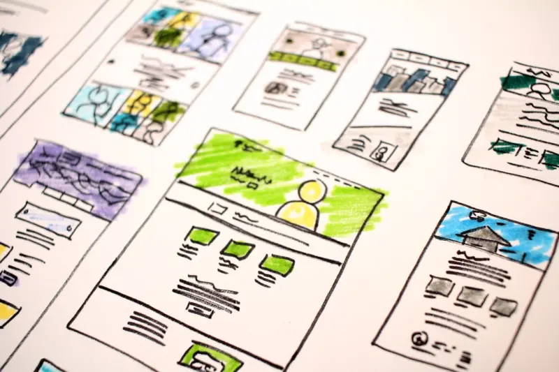
Designing for the Planet: Sustainable Web Design Strategies That Don’t Sacrifice Style
Discover how to blend stunning visuals with sustainability by optimizing assets, building performanc... Read More
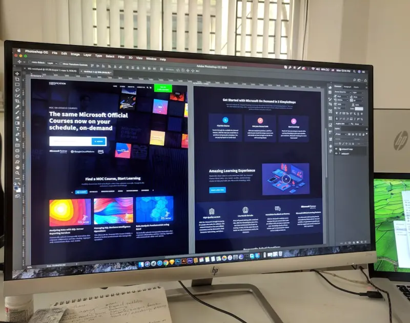
Pixels Meet Psychology: Rethinking Web Design for Real Interaction
A fresh perspective on web design that blends brain science with modern UI tactics—micro‑interac... Read More
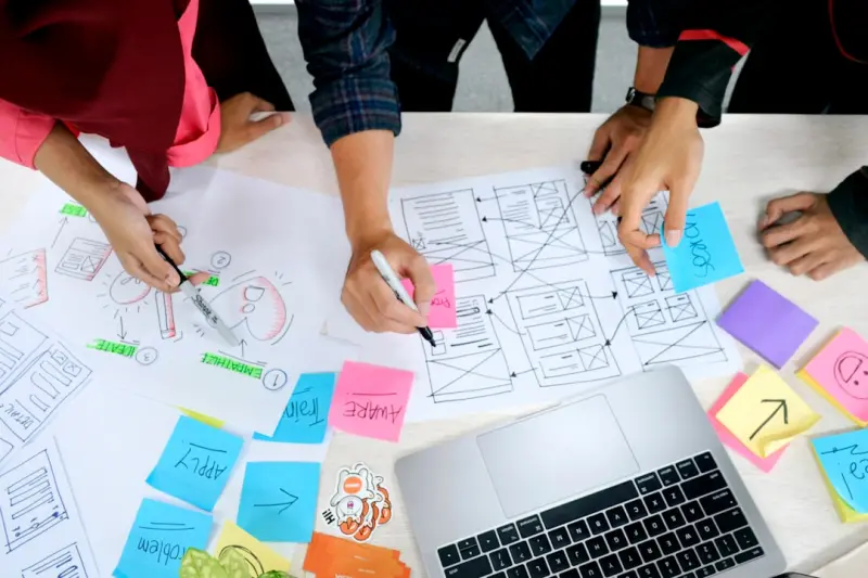
When Design Meets Data: Building Adaptive Web Experiences
Adaptive web design blends robust design systems, performance‑first architecture, and data‑drive... Read More
Top Posts

When Players Become Creators: The Community‑Driven Revolution in Gaming
A deep dive into how gamers are transforming from consumers to co‑creators, the technology enabling this shift, real‑world success stories, and practical st...Read More

Turning Social Audio into a B2B Lead Machine
Explore the untapped potential of social audio channels, from Clubhouse to Twitter Spaces, and learn practical strategies to turn live conversations into a stea...Read More

When AI Becomes the Silent Partner in B2B Growth
AI is emerging as a subtle yet powerful force in B2B, turning massive data streams into clear, actionable insights, fostering trust, enabling co‑creation, and...Read More

Cleaning Green: How Smart Chemistry Is Redefining Home Hygiene
Explore how enzyme‑based cleaners, smart sensors, and reusable materials are transforming everyday cleaning into an eco‑friendly practice that saves water, ...Read More
0 Comments
Post Comment
You will need to Login or Register to comment on this post!