
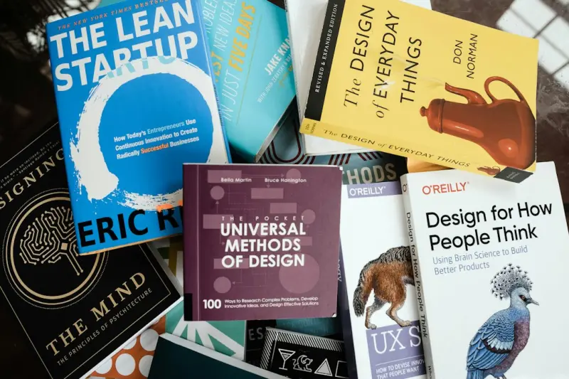
When I first started sketching wireframes on a hand‑drawn napkin, the web felt like an endless canvas—every pixel was a fresh opportunity to wow a visitor. Today the canvas is still endless, but it’s also crowded, noisy, and increasingly short‑tempered. Users are juggling notifications, multitasking across multiple screens, and battling digital fatigue. In this climate, the old mantra of “more is better” is dead‑weight. What we need now is a new discipline: Design for Cognitive Economy.
Why Cognitive Economy Matters More Than Ever
Think about the last time you opened a website and felt instantly overwhelmed. Maybe the homepage was a barrage of carousels, pop‑ups, and flashing CTAs. Your brain immediately starts triaging: What is essential? What can I ignore? If the answer isn’t obvious within two seconds, the user’s attention drifts elsewhere. This isn’t just a UX annoyance—it’s a business risk. Bounce rates climb, conversions dip, and brand perception suffers.
Design for cognitive economy means treating the user’s mental bandwidth as a finite resource. It’s about delivering the right information, at the right time, in the right visual hierarchy, while stripping away anything that competes for attention without adding value.
Four Pillars of Cognitive‑Economy Web Design
- Intent‑First Layouts: Start with the user’s primary goal and build the page around that, not around the latest design trend.
- Micro‑Delight Timing: Sprinkle tiny moments of joy (animations, subtle hovers) that appear only when the user is ready for them.
- Adaptive Information Density: Let the page read differently on a phone, a laptop, or a large TV—without sacrificing the core message.
- Transparent Load Experience: Show progress, give context, and avoid blank screens that make users wonder if the site is broken.
1. Intent‑First Layouts: Start With the Question, Not the Answer
Most designers begin with a visual mood board—colors, fonts, hero images—then try to fit content into that aesthetic. It feels elegant, but it often forces users to hunt for what they actually came for.
Flip the process. Begin by mapping the top three questions a visitor might have: Who are you? What do you offer? How do I get started? Then arrange those answers in a hierarchy that mirrors the natural reading flow. This approach reduces friction and gives users a clear path forward.
For example, a B2B SaaS homepage that instantly shows a concise value proposition, a brief video that confirms relevance, and a single, prominent CTA (“Start Free Trial”) can cut decision time dramatically. The rest of the page can support the journey with proof points, testimonials, and deeper technical details—only after the core intent is satisfied.
2. Micro‑Delight Timing: Joy on Their Terms
Delight is a powerful lever, but it’s a double‑edged sword. An auto‑playing carousel might feel lively to a designer, yet it distracts a user who’s trying to read a headline. The trick is to make micro‑delights contextual and lazy‑loaded.
Use CSS transitions that trigger only when an element scrolls into view. Let icons animate subtly when a user hovers, but keep static defaults for those on slower connections. This respects the user’s bandwidth and mental load while still rewarding curiosity.
When done right, these moments become memorable cues that reinforce brand personality without demanding extra attention.
3. Adaptive Information Density: One Design, Many Experiences
Responsive design has been a staple for years, but true adaptability goes beyond simple breakpoints. It’s about reshaping the information hierarchy based on the device’s context.
On a desktop, a detailed comparison table might sit beside a feature overview. On a mobile phone, that same table could be hidden behind an accordion, surfacing only when a user taps “See Full Comparison.” The principle is the same: Give the user what they need, when they need it, without overwhelming them.
Implementing this requires a content strategy that separates “core” from “supporting” data. Use JSON‑driven content blocks that can be toggled on or off based on screen size, user preference, or even network speed.
4. Transparent Load Experience: Show the Work In Progress
Nothing erodes trust faster than a blank screen that looks like a glitch. Users need reassurance that the site is loading, especially on slower connections.
Progress indicators don’t have to be generic spinners. Consider skeleton screens that mimic the layout of the content that’s about to appear. Or, if you’re pulling in data from an API, display a friendly placeholder like “Fetching the latest insights…” This tells users, “We’re on it,” and keeps the cognitive load low.
Transparent loading also dovetails nicely with AI‑powered search experiences that rely on real‑time data. By communicating progress, you prevent users from aborting the journey out of frustration.
Designing for the Future: The Role of Emerging Tech
While the core principles of cognitive‑economy design are timeless, technology offers new levers to amplify them.
AI‑Assisted Personalization
Machine learning can predict a visitor’s intent based on behavior patterns and surface the most relevant content instantly. Think of a dynamic hero banner that swaps out copy and imagery based on whether the user arrived from a blog post, an email campaign, or a paid ad. This reduces the “search” phase for the user, delivering a tailor‑made experience in seconds.
Edge Computing for Faster Perception
By moving critical assets (like CSS and essential JavaScript) to edge servers, you shave milliseconds off load time. Those fractions matter when the user’s attention span is already fragmented. Faster perception also means less cognitive strain—users can focus on content, not loading bars.
Voice‑First Interfaces
Even on the web, voice interactions are gaining traction. A well‑placed “Ask me about pricing” button that triggers a voice assistant can offload reading and let the user get answers hands‑free. This is especially useful for accessibility and for users in multitasking environments.
Case Study: A SaaS Redesign That Cut Bounce by 30%
One of our clients, a mid‑size analytics platform, faced a 45% bounce rate on their pricing page. Their original layout stacked four pricing tiers, each with dense feature lists, a background video, and a live chat widget that opened automatically.
We applied the cognitive‑economy framework:
- We reduced the tiers to three, each with a clear headline and a single primary benefit.
- We replaced the auto‑open chat with a discreet “Need help?” link that expands only on click.
- We introduced a progressive disclosure accordion for the feature list, keeping the page visually light.
- We added a skeleton screen that mimicked the final layout while the pricing data loaded.
Within two weeks, the bounce rate dropped to 31%, and the average time on page increased by 18 seconds. Most importantly, the conversion rate (free‑trial sign‑ups) rose by 12%—a clear signal that users felt more in control and less overwhelmed.
Practical Checklist for Your Next Redesign
Before you dive into mockups, run through this quick audit:
- Identify the top three user intents for each major page.
- Map a minimal visual hierarchy that serves those intents first.
- Limit on‑page animations to interactions that add functional clarity.
- Design skeleton screens for any data‑heavy sections.
- Plan adaptive content blocks that can be collapsed or expanded based on device.
- Prototype with real‑world latency using network throttling tools.
- Test with users under cognitive load (e.g., multitasking while browsing).
Follow these steps, and you’ll create a web experience that feels like a helpful guide rather than a demanding gatekeeper.
Connecting the Dots: Why Design Choices Echo Across Business Functions
Design doesn’t exist in a vacuum. A streamlined, cognitively‑efficient website reduces the burden on support teams, shortens sales cycles, and feeds cleaner data into your analytics stack. When users complete forms without frustration, you capture higher‑quality leads, which in turn powers better RevOps outcomes.
Moreover, a site that respects cognitive limits aligns with broader corporate values—like mental‑health awareness and sustainable digital practices. It signals to customers that you care not just about selling, but about their overall well‑being in a hyper‑connected world.
Looking Ahead: The Evolution of Web Design as a Trust‑Building Tool
As we move toward increasingly immersive digital experiences—augmented reality, 3‑D product visualizations, and AI‑driven chat—cognitive economy will become the silent guardian of trust. The more we rely on complex tech, the more we must anchor the experience in simplicity and clarity.
In the end, great web design is less about flashing the latest visual trick and more about earning the user’s mental real estate. When you give them space to think, act, and decide, you build a relationship that lasts beyond the first click.
Ready to audit your site through the lens of cognitive economy? Start with a single page, apply the four pillars, and measure the shift in user behavior. You might be surprised how much you can achieve by simply respecting the limited bandwidth of the human mind.

Jim Pearse, a seasoned freelance writer, brings a wealth of knowledge and passion to the world of home and garden. From the intricacies of landscaping to the nuances of interior design, Jim delves into every aspect of creating comfortable, beautiful, and functional living spaces.
Related Posts

Designing for Neurodiversity: A New Frontier in Web Experience
Discover the emerging discipline of neuro‑inclusive web design, where thoughtful visuals, adaptive... Read More

Designing for Neurodiversity: A Pragmatic Guide to Inclusive Web Experiences
A deep dive into neurodiverse‑first web design, offering practical principles, UI tweaks, and test... Read More
Pixels Meet Psychology: Rethinking Web Design for Real Interaction
A fresh perspective on web design that blends brain science with modern UI tactics—micro‑interac... Read More
Top Posts

Why Sustainable Storytelling and AI Are the New Engines of Business Growth
Amanda Williams reveals how blending sustainability, AI, and authentic storytelling creates a powerful growth engine for modern businesses, offering practical s...Read More

Why Modern Bloggers Must Blend Authentic Voice, SEO Savvy, and Sustainable Practices
Tyler Johnson reveals the 2024 blogging playbook: authentic voice, intent‑focused SEO, multimedia, community building, and sustainable tech that turn posts in...Read More

Designing a Sensory Garden: A Journey Toward Everyday Healing
A sensory garden engages all five senses, offering a therapeutic retreat that reduces stress and boosts wellbeing. Learn practical steps to design, maintain, an...Read More

Automation + Empathy: A New Marketing Playbook for SaaS
This post outlines a human‑first framework that combines intent‑based segmentation, modular content journeys, real‑time sentiment loops, and early advocac...Read More
0 Comments
Post Comment
You will need to Login or Register to comment on this post!